
Air.inc — From Clutter to Air: One Line of Script Turned into a Nine-Scene Launch Video
Air is a creative operations platform, roughly Google Drive, Figma and Frame.io in one place. For its launch video I took a single line of script from concept and style frames through to a finished 1:59 animation, with music, sound effects and voiceover.
Role
Designer
Art direction & motion
- Company
- Air (trial task)
- Scope
- Concept, art direction, style frames, motion
- Format
- 16:9 frames, then full animation
- Period
- Q4 2026

The brief
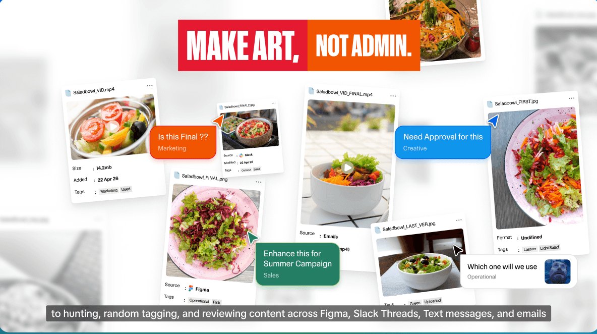
“Let’s say you’re a creative at a salad company with 212,000 files. The average creative team spends 3 months each year hunting, tagging, and reviewing content across Figma, Slack threads, text messages and emails.”
The whole brief hung on that one line. The video had to earn trust in an AI tool, make the pain felt, and stay true to Air’s own brand.
Key questions
What comes before this line?
The viewer needs a reason to trust an AI with their files, so the video opens with a hook about how far AI has come.
What does the creative feel?
Not frantic, but buried. 212,000 files is less a number than a pile you can’t see the bottom of.
What does “Air” look like?
The name answers the problem. If the pain is clutter, the brand is space, light and room to breathe.
Key strategy
The sequence should physically go from crowded to open. Dark and tight means old tools; light and open means Air.
Concept
The hook
Earn attention in three seconds. Dark, boxed-in, social-feed energy.
Meet Air
Introduce the brand and narrator. The frame opens up into sky.
The pain
Deliver the script line: a clean room, then a pile of files.
The solution
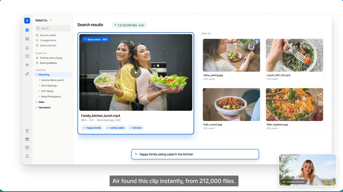
Show Air doing the work. Upload, understand, organise, find: calm and precise.
Closing
Turn three months into days, then invite. The chaos collapses into one window, back to open sky.
From frames to video
One continuous world
No cuts. The hook card becomes the Scene 2 window, a thumbnail becomes the preview, the chaos becomes the vortex.
Move the camera
Same image at a different size? Zoom one plate instead of swapping pictures.
Calm easing
Smooth ease-in-out on every move, no bounce: the brand is about breathing room.
Layered for motion
Every frame was built with named, separated layers: narrator, sky, UI, type and cards each move on their own.
Matching the brand
Every scene was checked against the Air Brand Guidelines v1.0 and Air’s help docs.
- Product UI Icon rail, libraries sidebar, Kanban toggle, pinned comments and Uploads, as the help docs describe them.
- Typography Control Compressed for short bold headlines, Control Upright for copy, one cursive word for emphasis.
- Colour Air blue leads. Flash red and Ember orange appear only in badges, as accents.
- Voice The pain peaks on Air’s own line, “Make art, not admin.” Product scenes stay calm and plain.


Reflection
One sentence in. A launch video out.
The brief gave me one sentence. The frames decided what it needed around it; animating them proved they worked once they had to move, sound right and stand next to the client’s own brand book.
Three things changed on the way: the search bar moved to the bottom, red became an accent, and the pain now ends on Air’s voice instead of a number.
Created as a trial task for Air. Not an official campaign. Air name, logo and fonts belong to Air. Figures from public sources, Nov 2026. Voiceover is a synthetic placeholder.