
Koprez Checkout Redesign — From Size Chart to Bundle First
An enterprise Funnelish merchant needed its foot-sleeve checkout to look premium and sell better, fast. I rebuilt it around the bundle choice and made every cost visible, keeping the brand, products and offer.
Role
Product Designer
- Company
- Funnelish
- Scope
- Checkout redesign
- Platform
- Desktop and mobile
- Period
- Jun 2026
The brief
Make a working checkout look premium and convert better, without changing the brand.
Keep the colours, product images, copy and product titles, and build the product list with what the funnel builder already offers, with minimal custom code. My rule for every section: make the choice obvious and every cost visible.
01 First screen & size guide
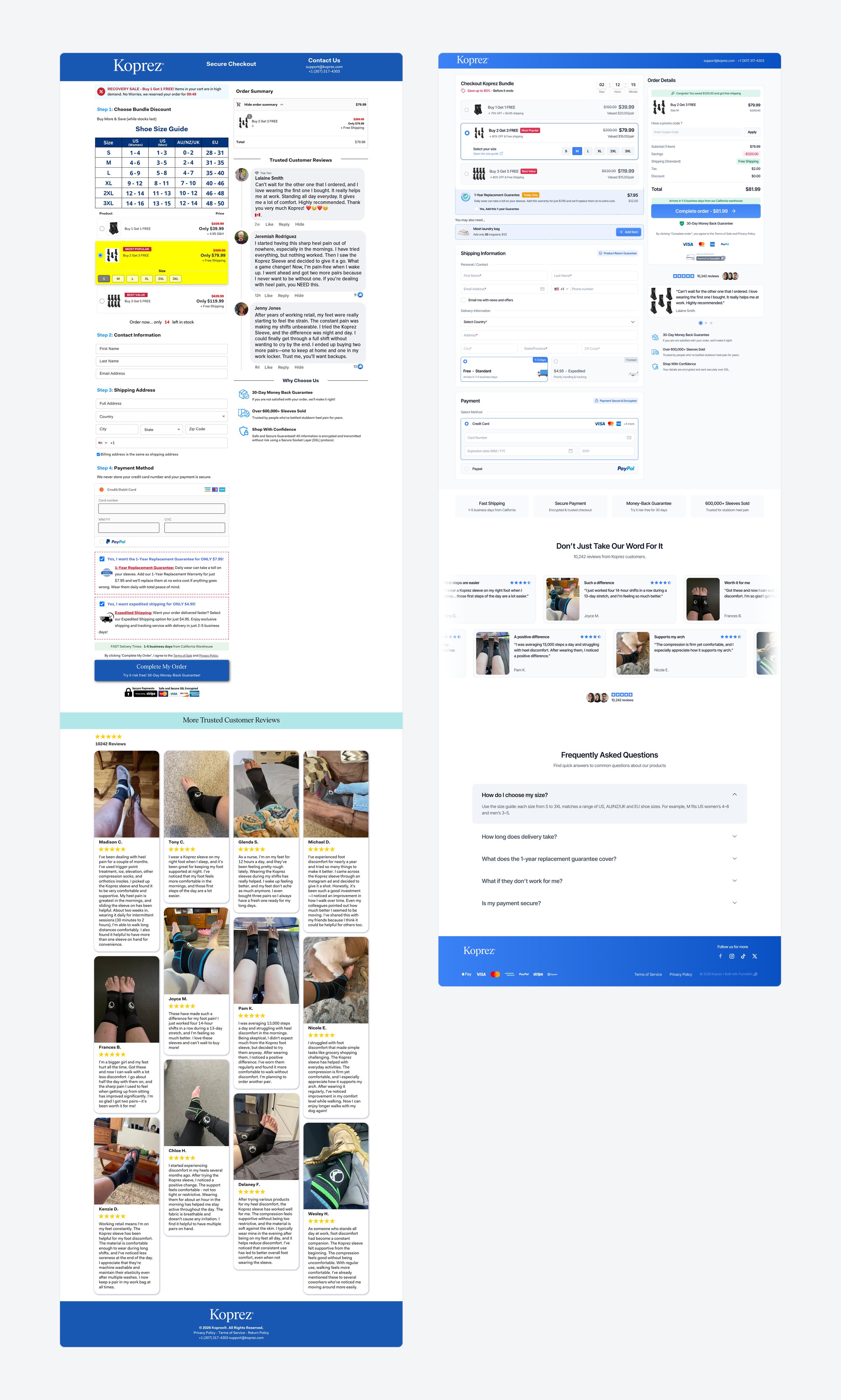
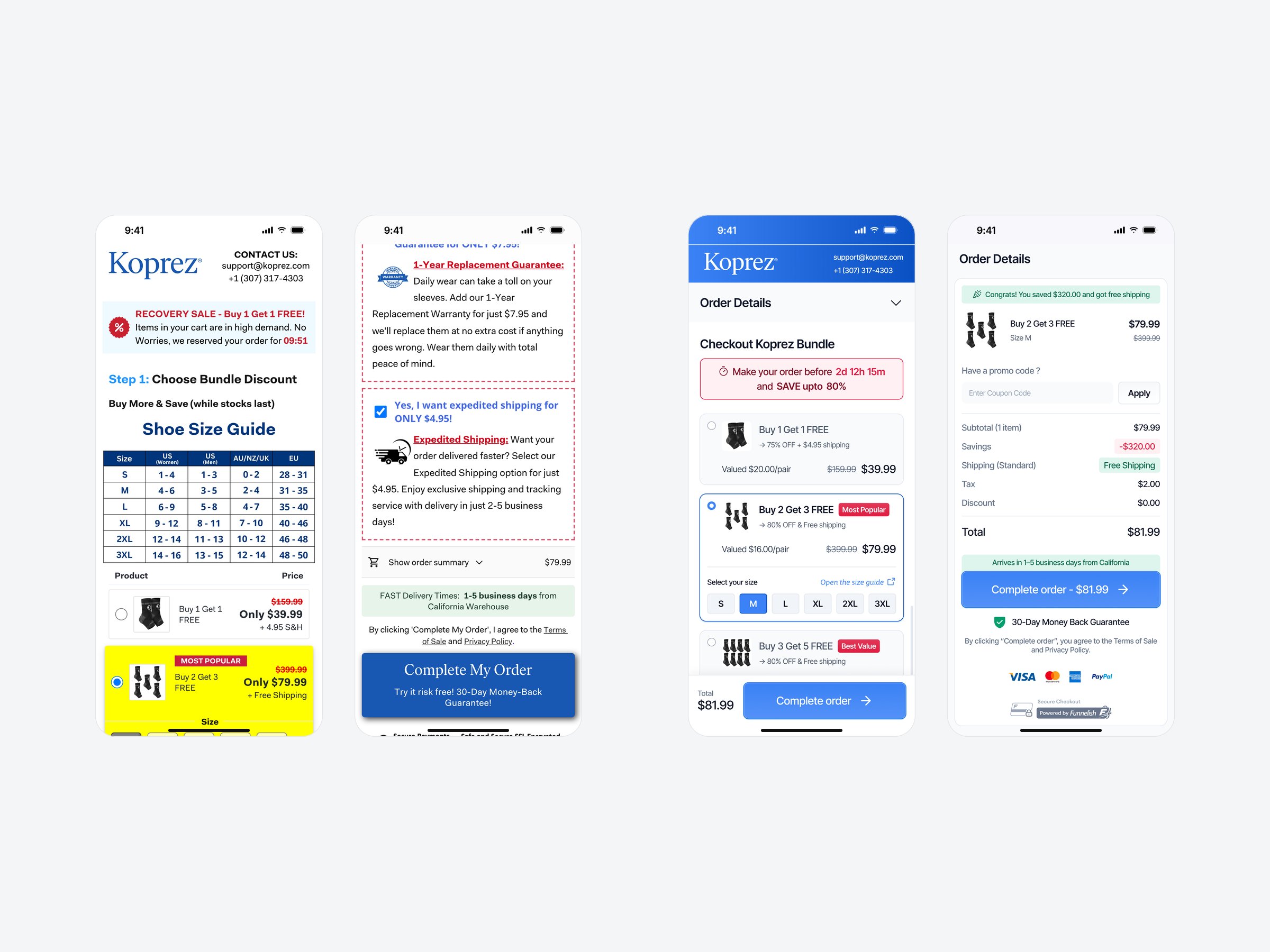
- Problem A full size-guide table filled the first screen before any product, and the chosen bundle became a bright yellow block.
- Change Three bundle cards with badges and the value per pair. Sizes and an “Open the size guide” link sit inside the chosen card.
- Why it works The offer is the first thing a shopper sees, and the chart is one tap away exactly when a size is picked.
02 Every cost visible
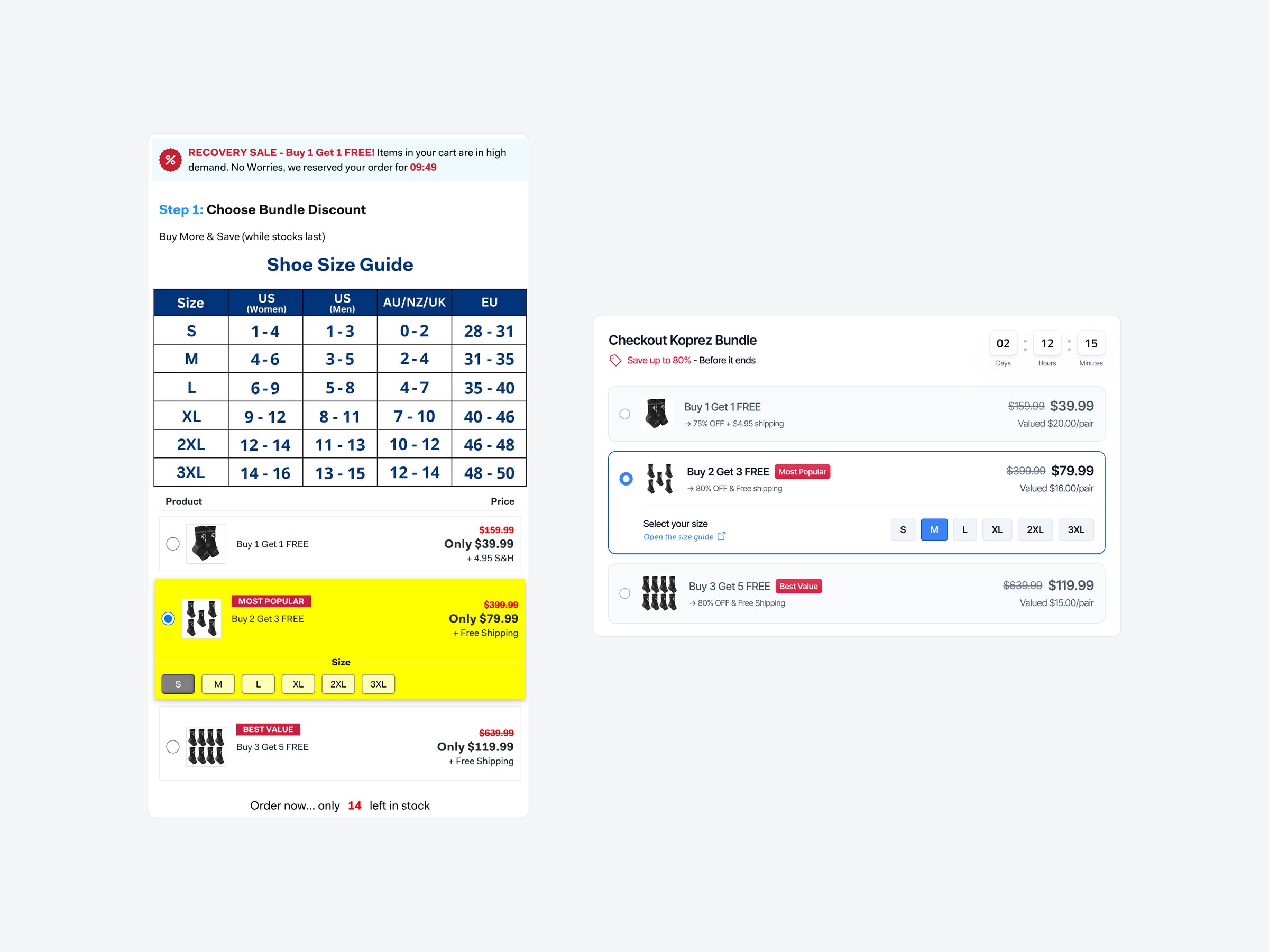
- Problem The guarantee and expedited shipping were pre-ticked under the card form, while the summary still showed $79.99.
- Change The guarantee is an opt-in right under the bundles. The summary lists savings, shipping, tax and any add-on, and the button shows the total.
- Why it works Extra costs are the top reason shoppers abandon a checkout once “just browsing” is set aside (Baymard). Showing them up front removes the surprise.
03 Form & delivery
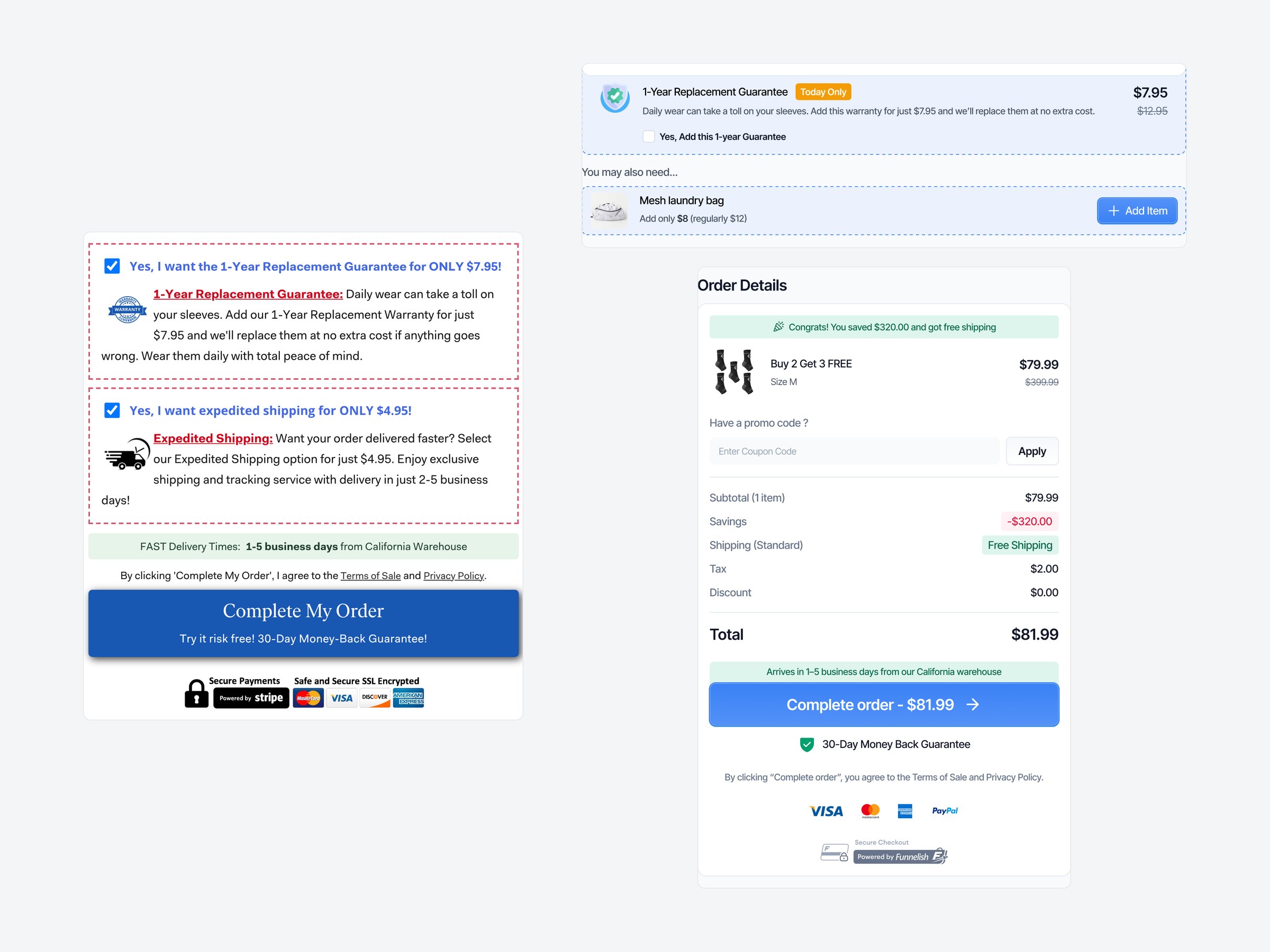
- Problem “Step 2” and “Step 3” headings over plain fields, and faster delivery sold as a pre-ticked checkbox further down the page.
- Change Fields grouped under small labels, with City, State and ZIP on one row. Delivery is a choice: free standard by default, or paid expedited.
- Why it works The form reads shorter, and delivery becomes an honest choice instead of a hidden upsell.
04 Social proof
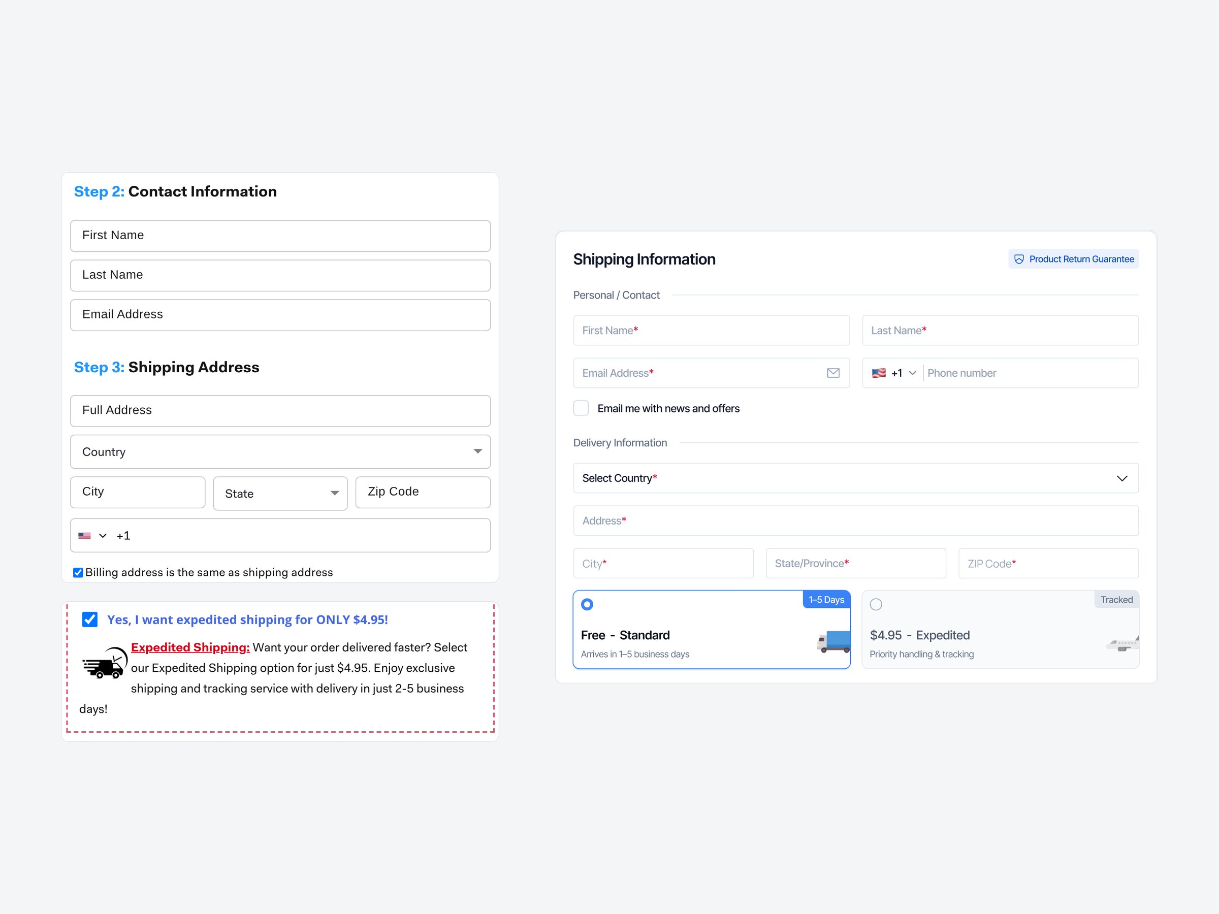
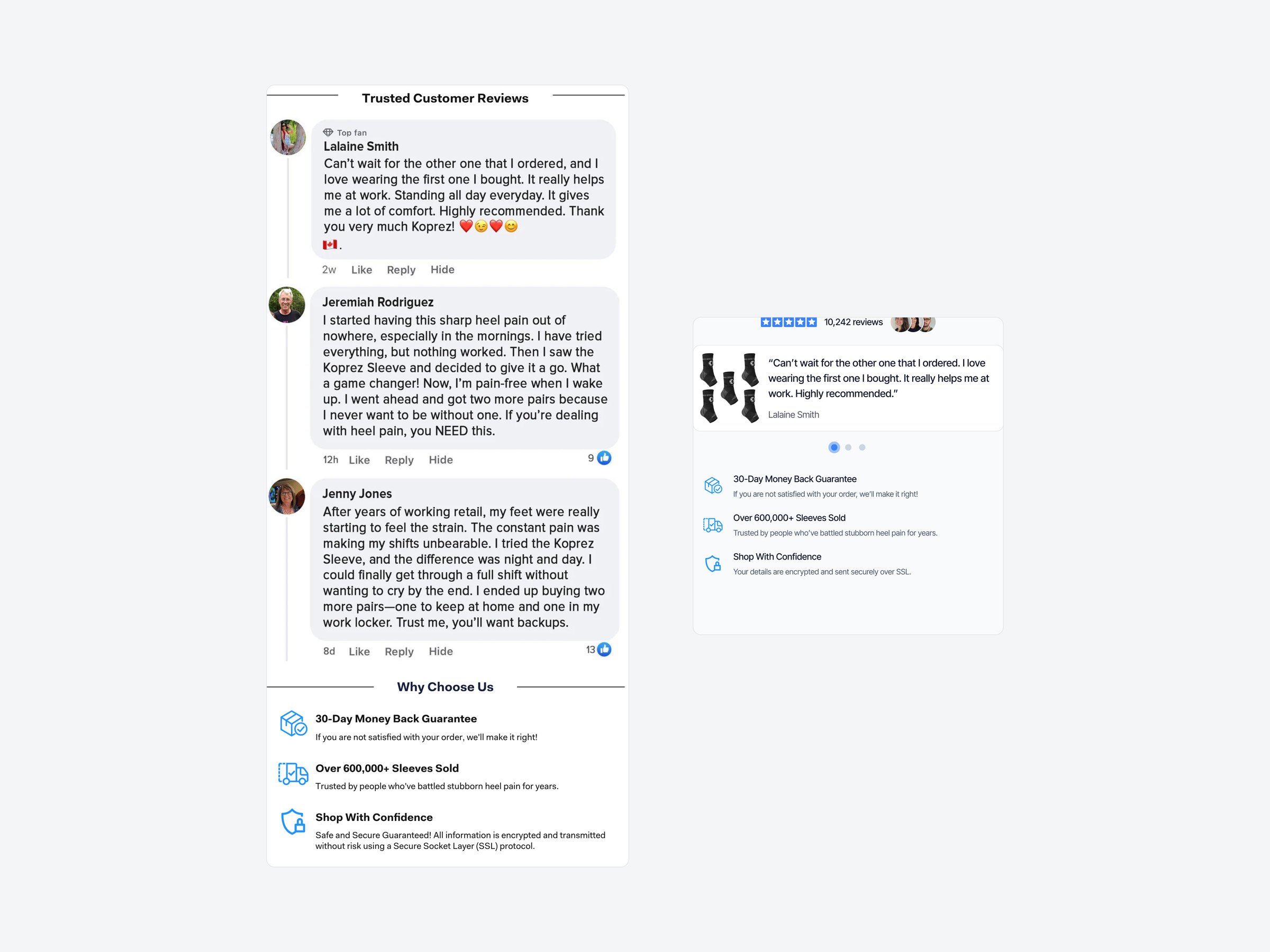
- Problem Three long Facebook-style comments and a “Why Choose Us” list beside the form, competing with it for attention.
- Change A rating line, one short review at a time and the same three reasons to buy, placed under the order summary.
- Why it works Proof stays close to the decision without turning the checkout into a sales page.
05 Mobile
- Problem The size chart filled the first screen, and the summary hid behind “Show order summary” just above the button.
- Change Order details sit collapsed at the top, the bundles come first, and a sticky bar keeps the total and “Complete order” within thumb reach on every screen.
- Why it works Shoppers always see what they pay, and the main action is one tap away wherever they are on the page.
What stayed, what changed
- Kept The Koprez blue and logo, product photos, bundle names, prices ($39.99, $79.99, $119.99), guarantees, real reviews and figures.
- Button “Complete My Order” became “Complete order – $81.99”: the same wording, now carrying the total so it is visible at the moment of commitment.
- Value per pair Added under each price ($20.00, $16.00, $15.00), so bigger bundles read as the better deal.
- Reviews Trimmed to their key sentence with a short headline.
- Delivery One promise, “1–5 business days from our California warehouse”, taken from the original.
Customer portal
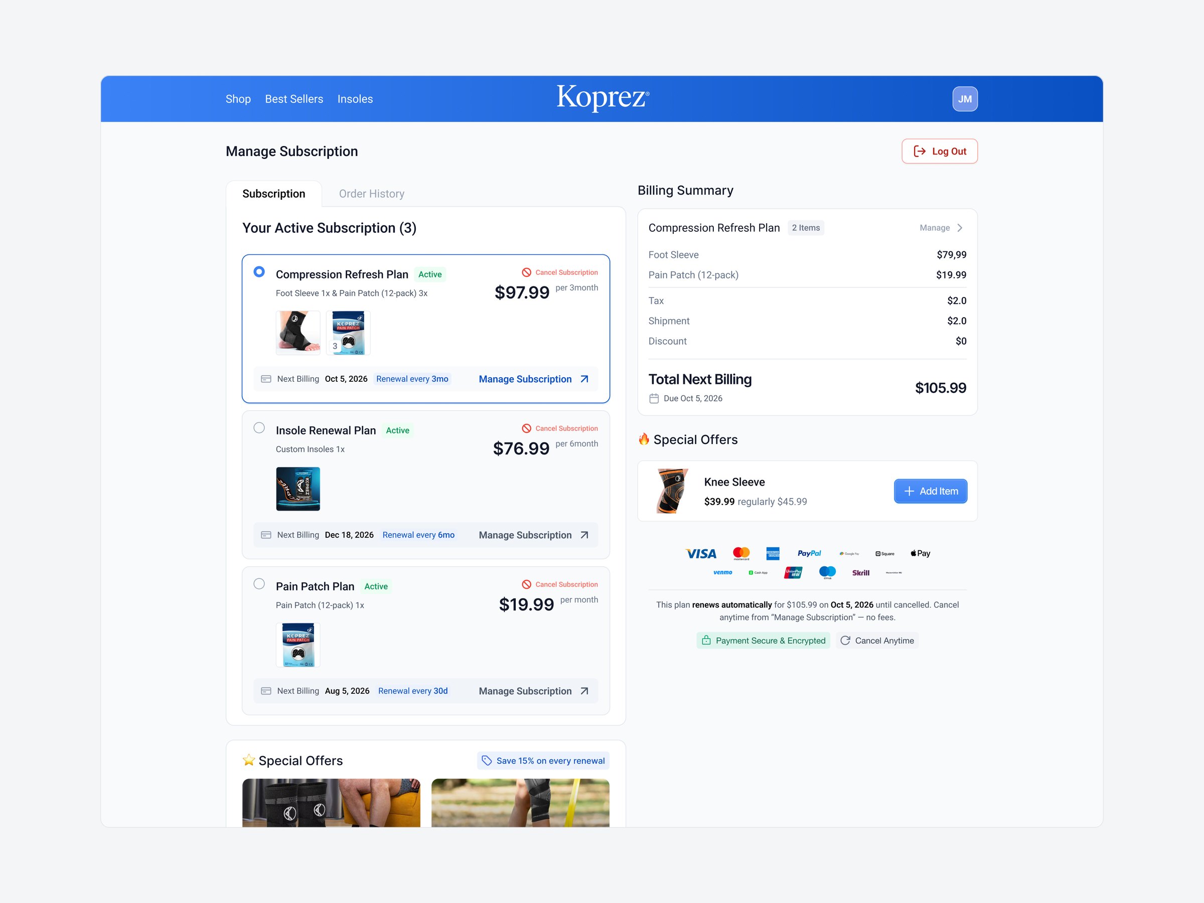
The same system carried into the subscriber account: active plans, next billing dates, a billing summary and add-on offers.
Outcome
Post-launch data isn’t available to me, so the impact above is expected, not measured. Success would be tracked by:
- Checkout conversion Orders divided by checkout visits, on desktop and mobile separately.
- Bundle mix Share of Buy 2 and Buy 3 orders, which drives average order value.
- Add-on attach rate Share of orders with the guarantee or the add-on.
- Refunds and chargebacks Requests linked to unexpected charges.
Designed at Funnelish for an enterprise merchant. Photos, reviews, prices and figures come from the original Koprez checkout; the laundry-bag add-on is a proposed cross-sell.