
Limura Skin Quiz — A Mobile Quiz Funnel That Turns a 1-Minute Quiz into an Order
Shoppers arriving from a social ad on their phone don’t know which skincare product fits them. I designed a 1-minute quiz that recommends a routine and sells it in the same session, shipped as a rebrandable Funnelish template and demoed with a fictional brand, Limura.
Role
Product Designer
Flow, mobile UI, prototype & QA
- Company
- Funnelish
- Scope
- Experience design, mobile UI, states, design-to-build QA
- Platform
- Mobile-first (375 px), plus desktop
- Period
- Feb–Mar 2026
The challenge
Ask enough to recommend the right products, yet keep it short enough that nobody drops off on a phone.
Beyond the screens, this meant product-level decisions: what to ask, when to ask for an email, how a recommendation becomes a cart, and how to grow order value without a pushy upsell.
Key questions
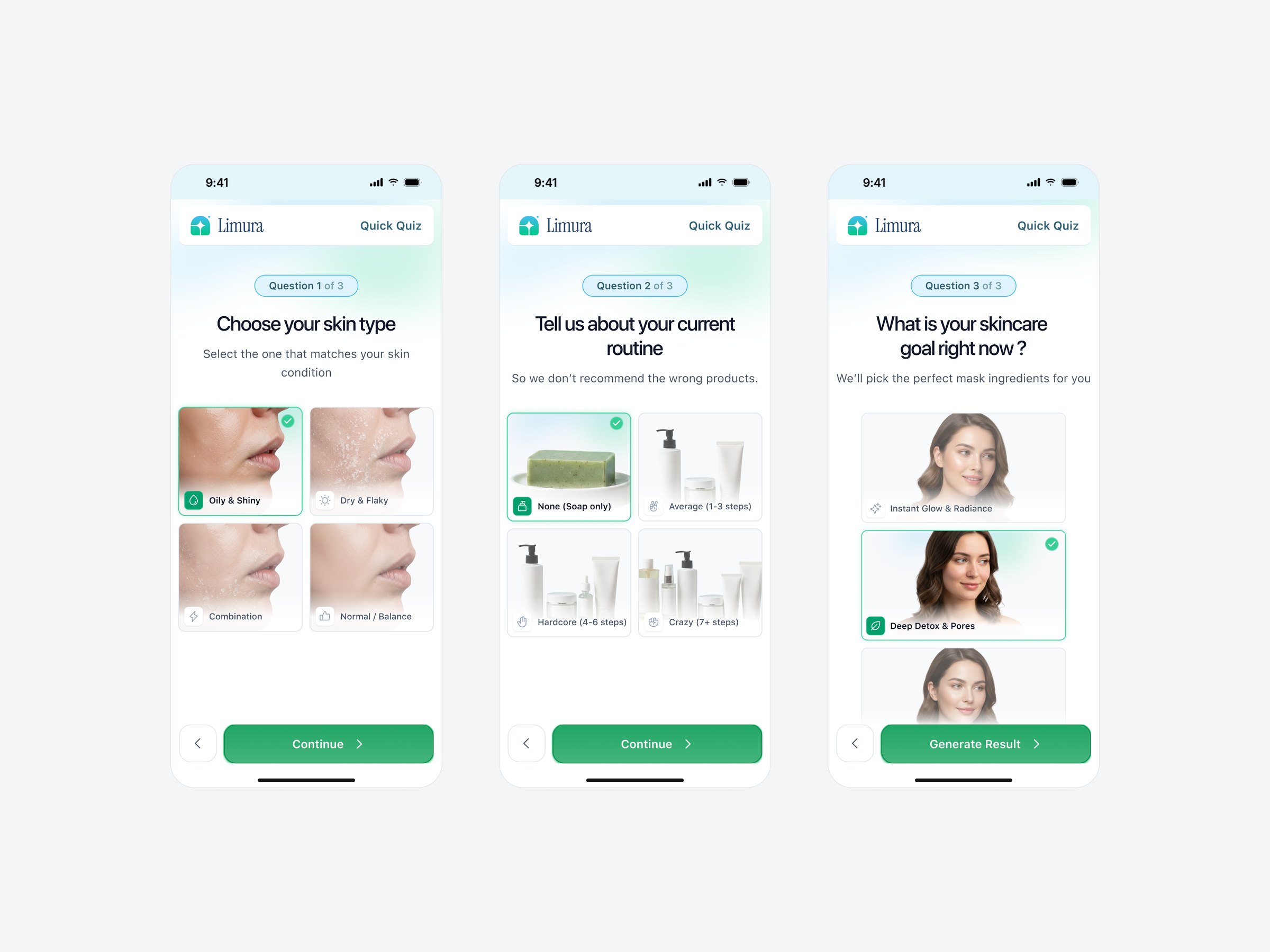
What can we learn in three taps?
Skin type, current routine and goal are enough to pick a routine, if each answer takes one tap.
When do we ask for an email?
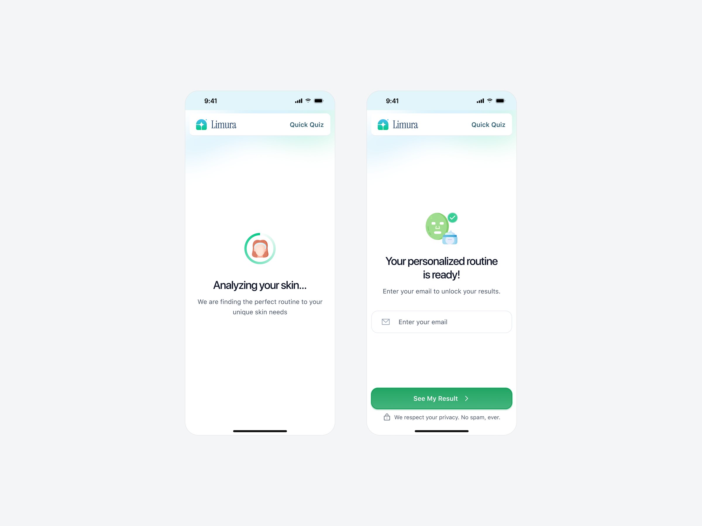
Only after the shopper has been promised something worth having: their personal result.
How does a result become a cart?
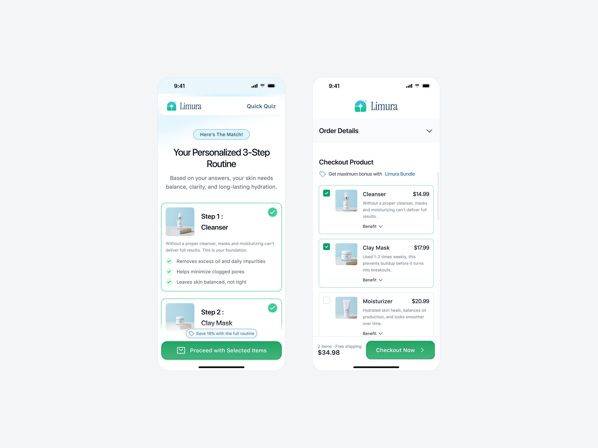
The recommendation should already be the order, not a list of products to go and find.
How do we raise order value politely?
Reward each extra item instead of interrupting checkout with a pop-up upsell.
Key strategy
Keep every step to one tap, turn the answer straight into an order, and reward each extra item instead of pushing it.
Design process
Brief and flow
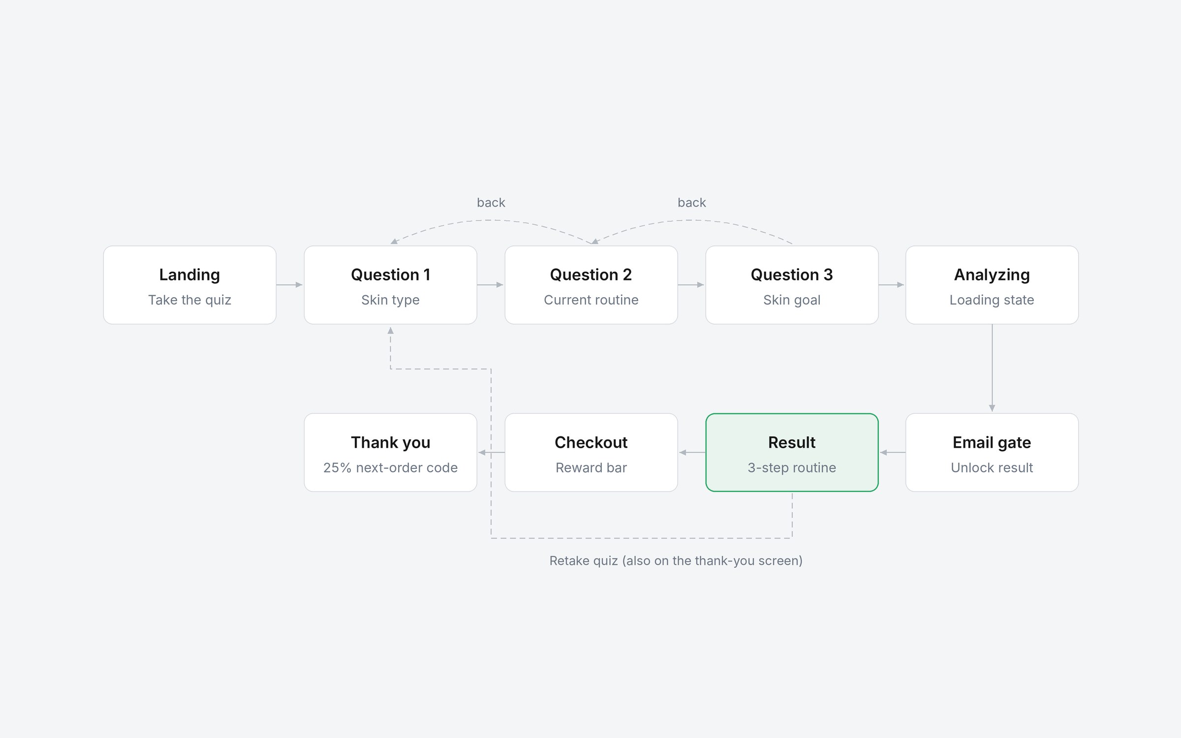
Turned the brief into one flow: landing, three questions, analyzing, email, result, checkout, thank you.
Mobile first
Designed every step at 375 px, then adapted each one to a 1440 px desktop layout.
States, not just screens
Designed selected, back, loading, retake and reward states alongside the happy path.
Prototype and handoff
Walked the team through a clickable prototype, then handed off with links to exact frames.
QA of the live build
Compared the built funnel with Figma, logged each gap with a screenshot, and checked the fixes.
Iteration
Rebuilt the flow as a coded prototype at iPhone 18 Pro size to test thumb reach and real typing, then moved every main action into a sticky bottom bar.
Key solutions
Progress and control
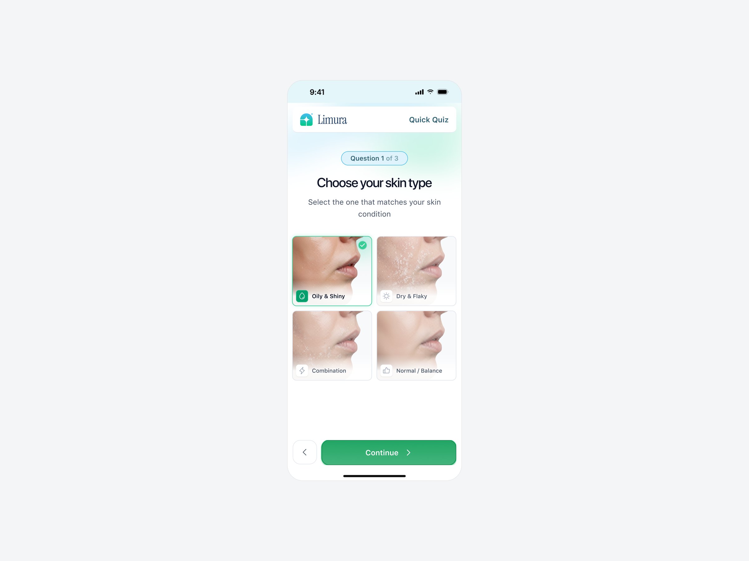
A “Question 1 of 3” pill, a Back button on every question, and a last button that says “Generate Result”.
Why each step matters
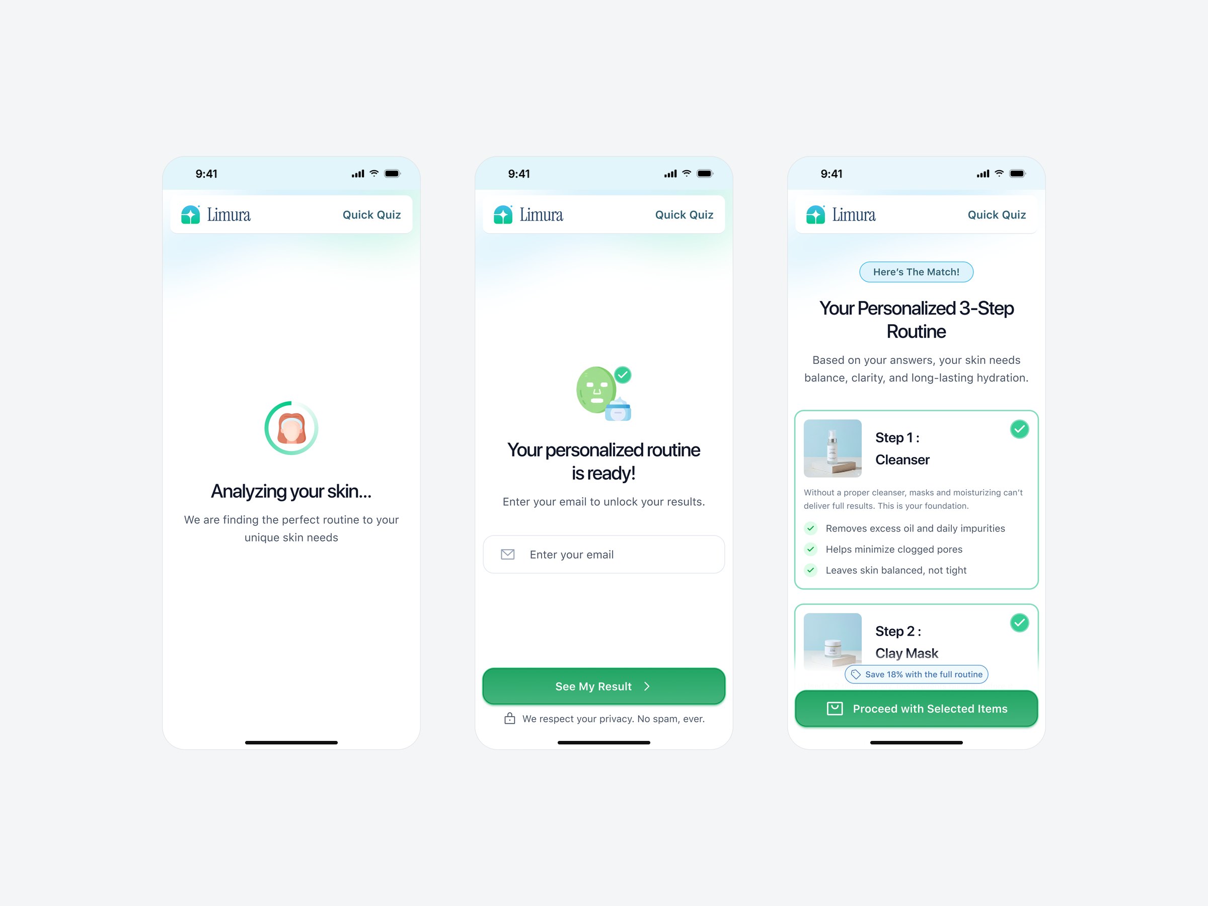
Every routine step explains its job in one line and three short benefits, and Retake is one tap away.
Reward progress bar
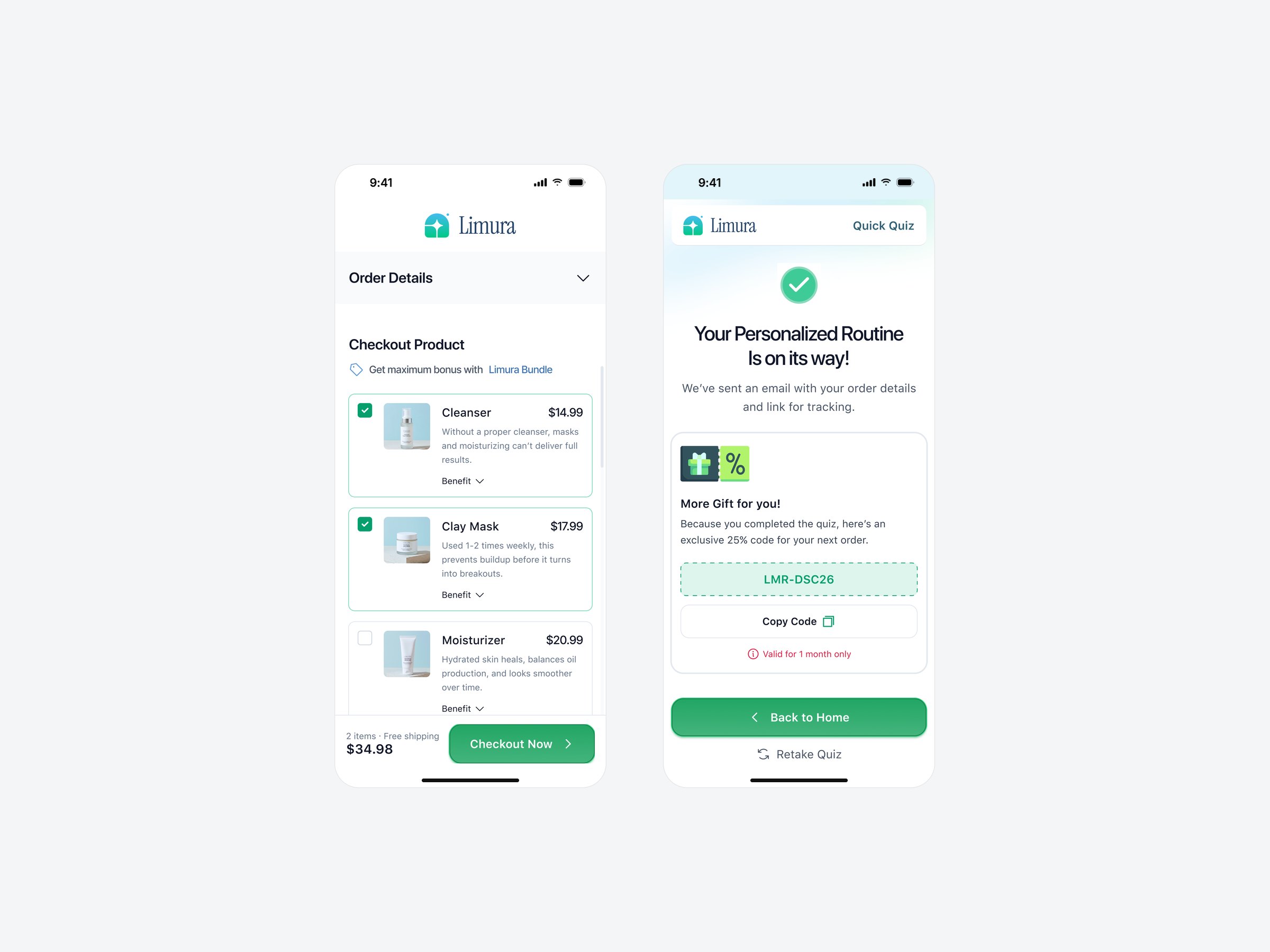
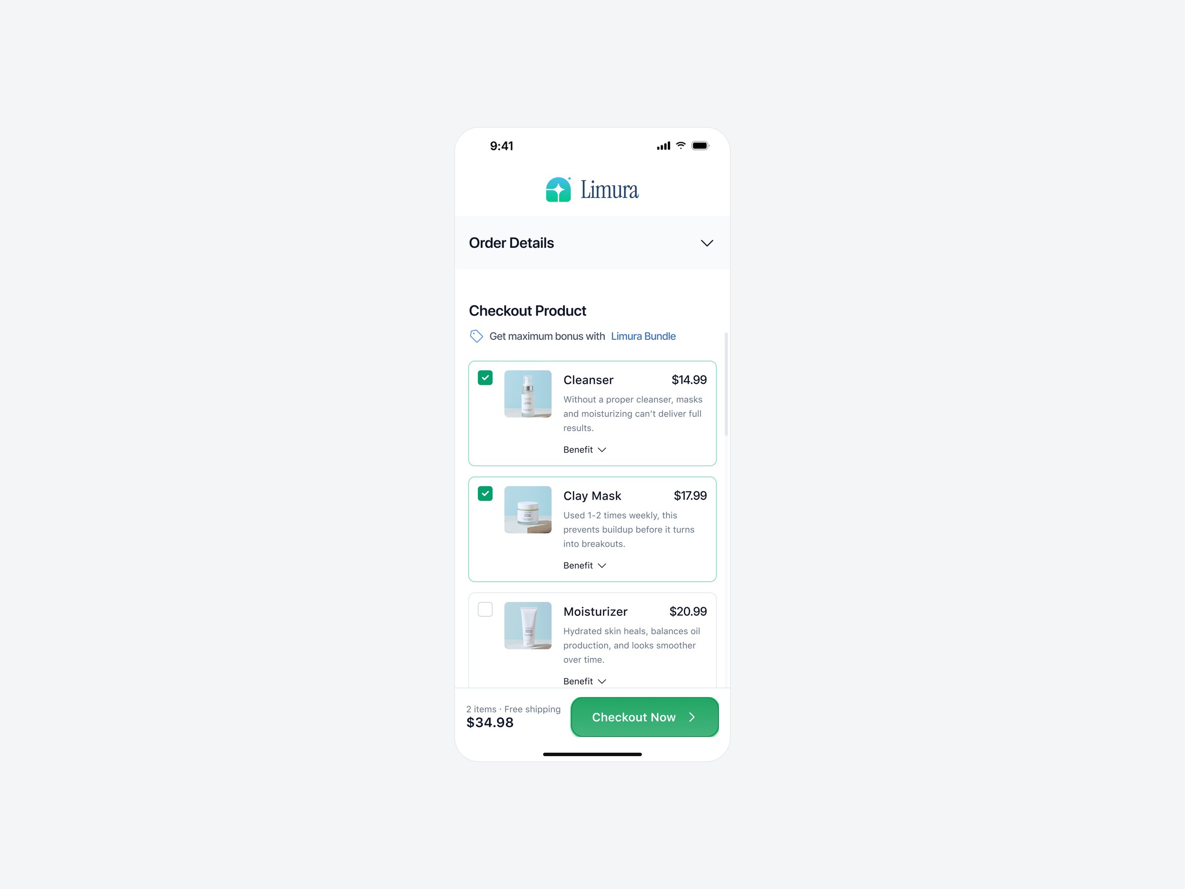
One item unlocks a free gift, two unlock free shipping, three unlock 18% off. The bar fills live in the order summary.
A reason to come back
The thank-you screen offers a 25% next-order code with Copy Code and a one-month validity note.
Design decisions
States & edge cases
- Answer selected Green border, a check badge and a filled icon; the other cards stay neutral.
- Going back A Back button on every question, with earlier answers kept.
- Waiting for results “Analyzing your skin…” with a progress ring instead of a blank screen.
- Not happy with the result Retake Quiz on both the result and the thank-you screens.
- Free shipping unlocked The delivery line switches to “Free” and the total updates at once.
- Missing details Checkout marks only the empty fields and scrolls to the first one.
Design-to-build QA
Before release I reviewed the live funnel against the Figma file and logged every gap with a screenshot and a frame link.
- Checkout logic Shipping shown as free once two items are in the cart.
- Reward bar Built with all three rules: free gift, free shipping, 18% off.
- Content Missing landing-page reviews added from the design.
- Layout A landing section that drifted from the design corrected.
Accessibility & mobile details
- Contrast Placeholder, helper and progress text tuned to meet WCAG AA 4.5:1; the brand green is kept for buttons.
- Touch targets Every control is at least 44 pt, including checkboxes and the “Benefit” toggle.
- Keyboard-aware The bottom bar rides above the on-screen keyboard, and the email typed in the quiz is carried into checkout.
- Calm motion Transitions respect the reduced-motion setting.
How success is measured
- Quiz completion Share of landing visitors who reach the result.
- Email capture Share of quiz finishers who enter an email at the gate.
- Bundle take-rate Share of orders with all three steps, which drives average order value.
- Checkout conversion Orders divided by shoppers who reach checkout.
Outcome
- Shipped as a template Live for Funnelish merchants to rebrand, with mobile and desktop versions of all nine steps.
- End-to-end ownership From brief and flow to UI, states, handoff and QA of the live build.
- A sale-ready quiz Recommendation, cart and checkout in one session, without a pop-up upsell.
Built for Funnelish as a ready-made template. Limura is a fictional demo brand; product photos and reviews are placeholders. The video and screens show the coded prototype; the Live link opens the Funnelish template build.