
The Hub — A UX Critique of a Job Board’s Search Page
The Hub is a Nordic startup job board. I reviewed its Find jobs page as a job seeker, found eight friction points, benchmarked each against well-known products, and recommended a fix for every one.
Role
Solo designer
Design critique & benchmarking
- Context
- “Good and Bad Design” critique session, Dipa Inhouse
- Scope
- Heuristic review, pattern benchmarking, recommendations
- Platform
- Desktop web, thehub.io/jobs
- Period
- Aug 2023
The challenge
Job hunting is repetitive. Every search is several tries, so every bit of friction gets paid again and again.
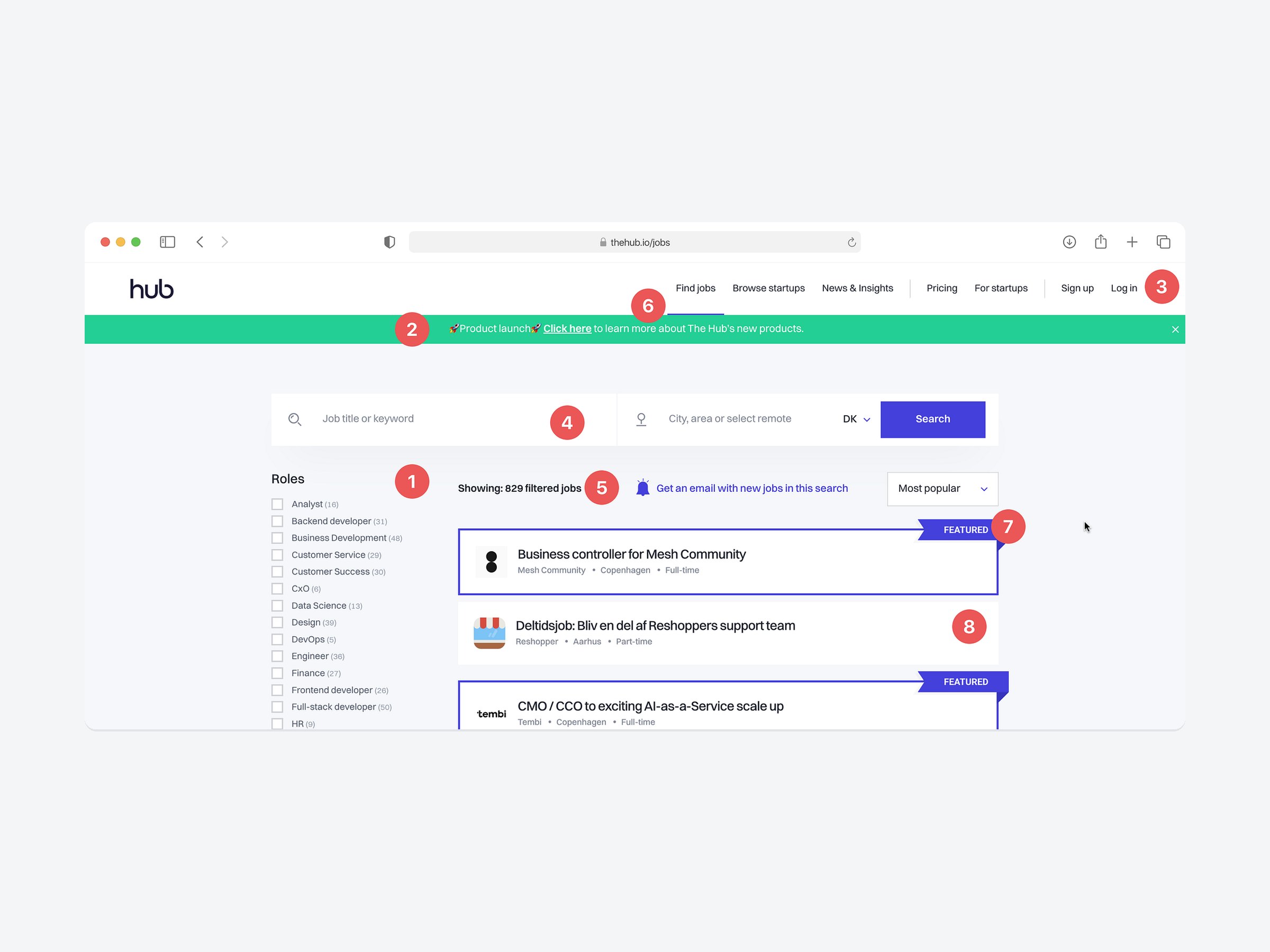
The Hub serves people looking for very different roles, from students to CxOs, so its search page has to handle many queries and filters. I used it myself while job hunting, and small issues kept slowing me down: undoing filters, judging which listings were still open, and telling what was selected from what was just highlighted.
Key questions
Can I change my search quickly?
Seekers refine and reset often. How many clicks does it take to start over?
Can I tell what is happening?
Do the count, the active tab and the card styles match the real state of the page?
Can I tell what is worth applying to?
Without a date, a listing from yesterday looks the same as one from three months ago.
Where does the eye go first?
Promotions, sign-up and featured jobs all compete with the results.
Approach
Walk the real tasks
Searched, filtered, reset and compared jobs on the live page as a job seeker, and noted every point of friction.
Name the pattern
Matched each issue to a common UI pattern (filters, search input, banner, navigation, cards) and to the usability heuristic it breaks.
Benchmark
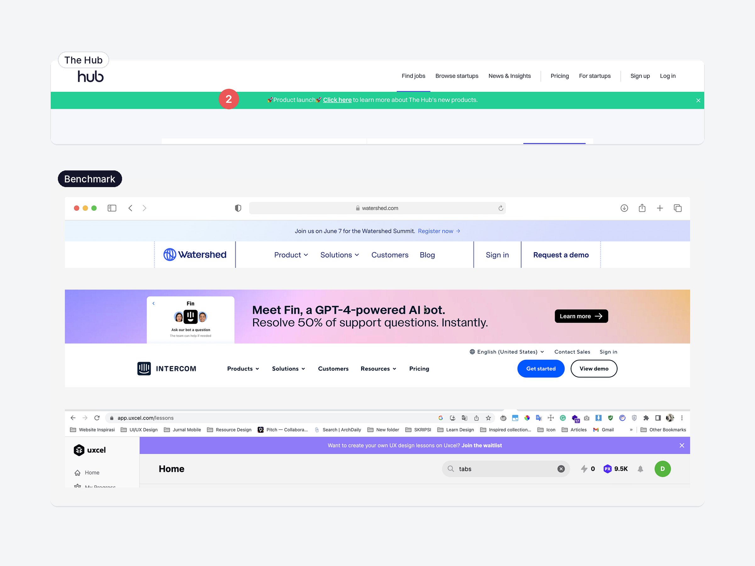
Compared how Uxcel, Figma, Dribbble, Lattice, Intercom, Watershed, Pitch and Halo Designers solve the same pattern.
Prioritise
Rated each issue by how often seekers hit it and how much it costs them, then ranked the fixes.
Recommend a fix
For each issue, proposed a fix based on the pattern that worked best in the benchmarks.
What I found
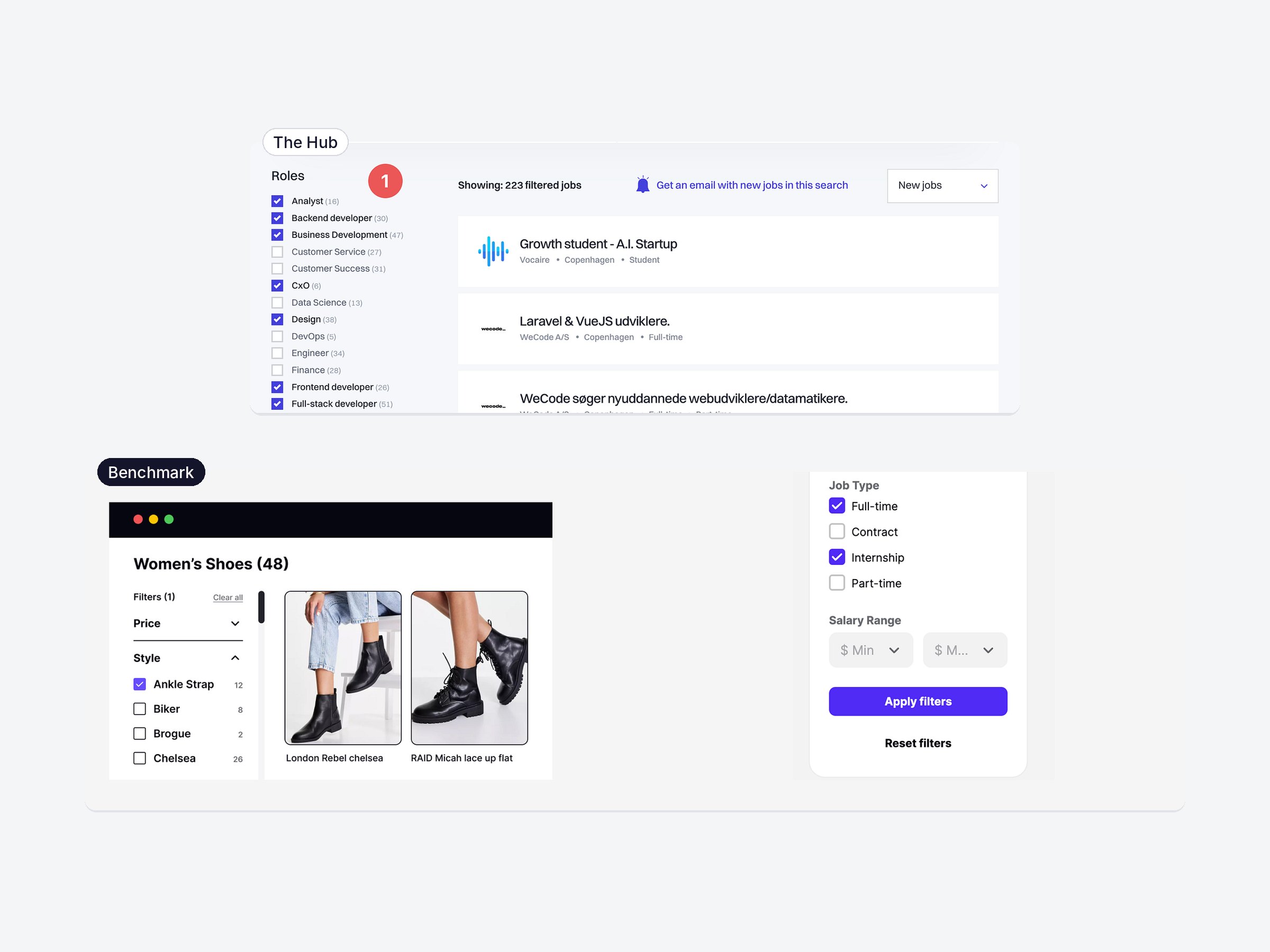
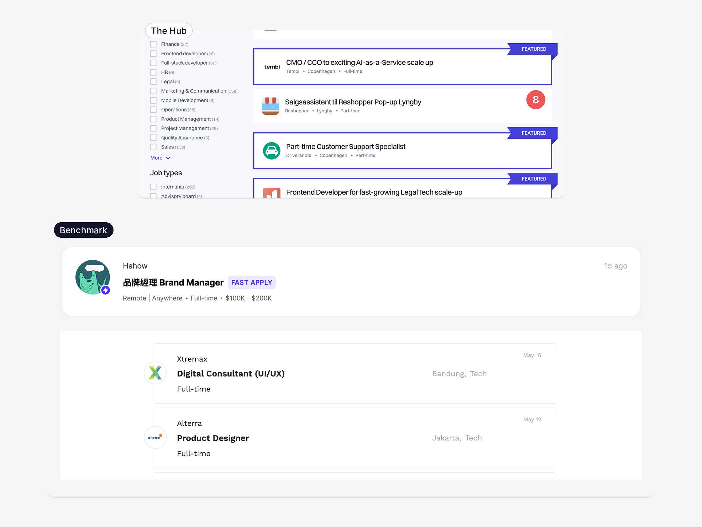
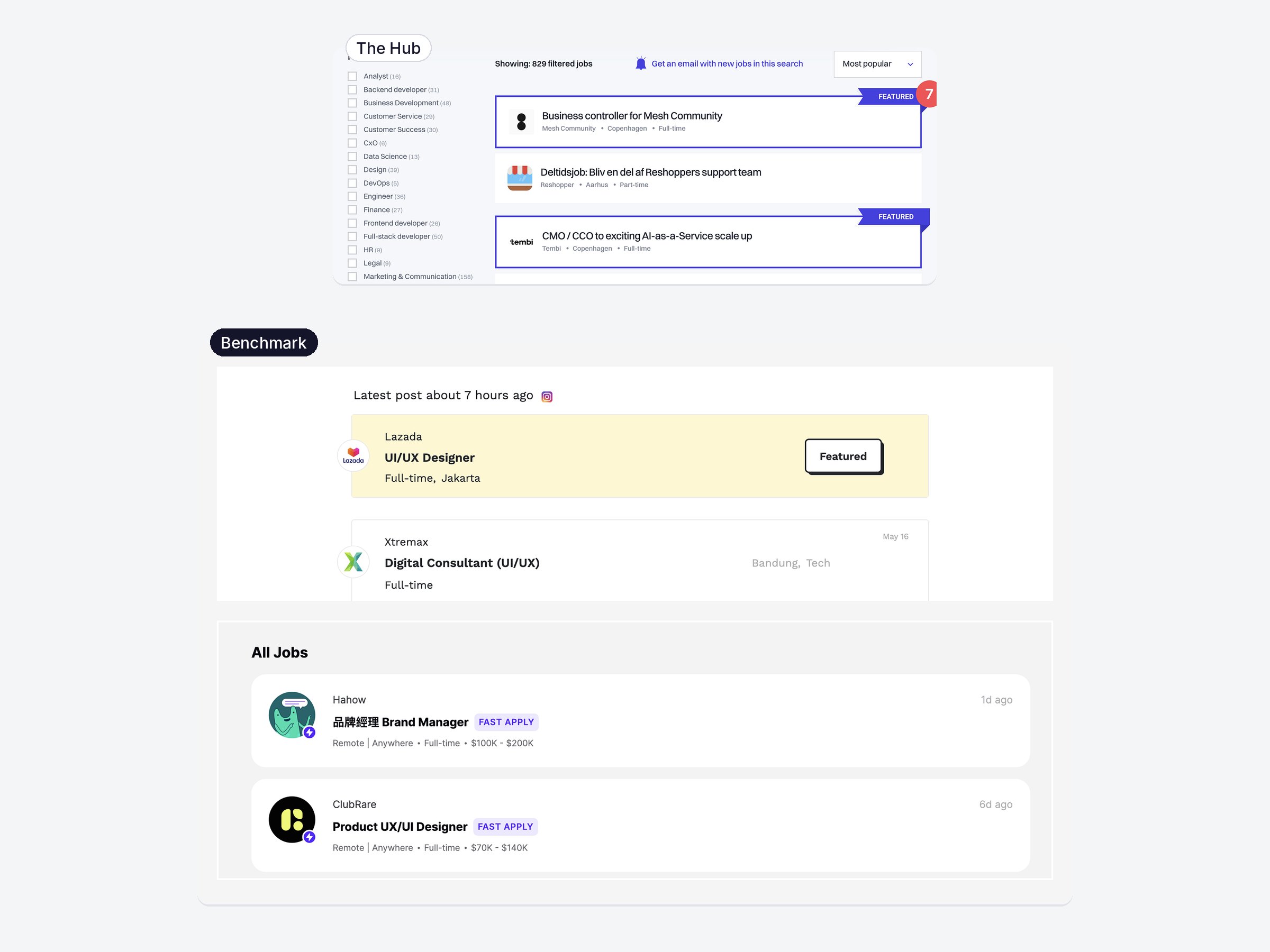
Numbers match the markers in the screenshot above. Ranked by how often a job seeker hits the issue and how much it costs them. Each issue is shown next to how other products handle the same pattern, with the fix I recommend.
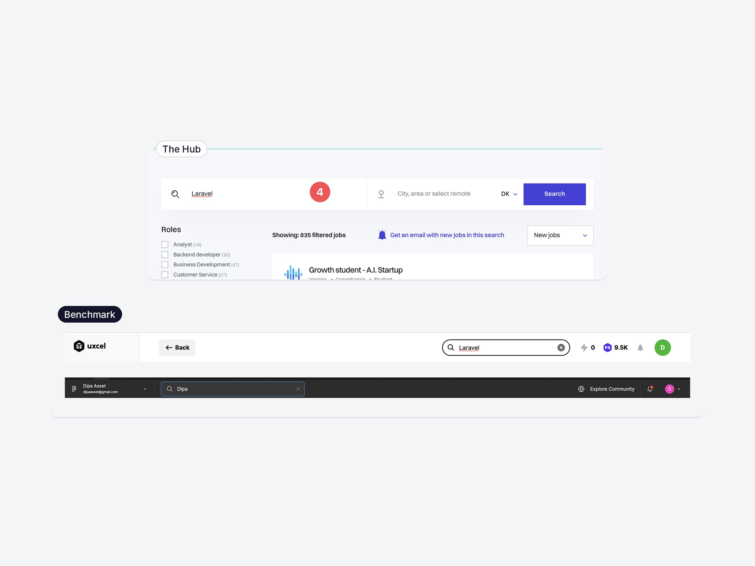
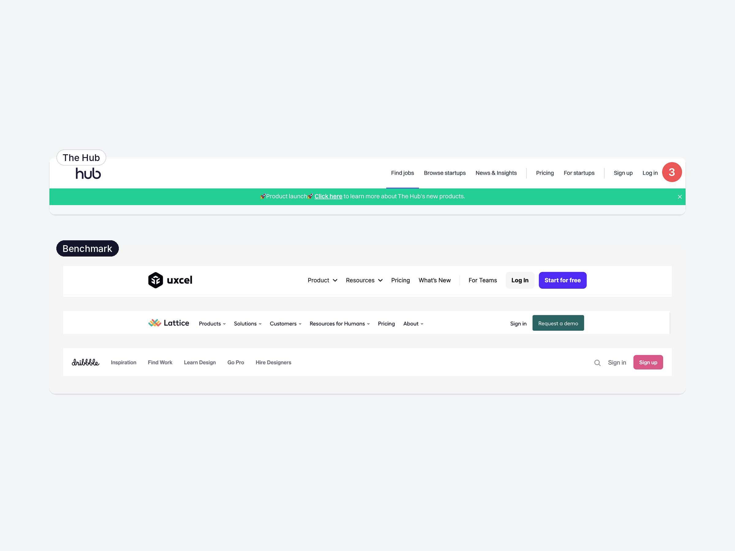
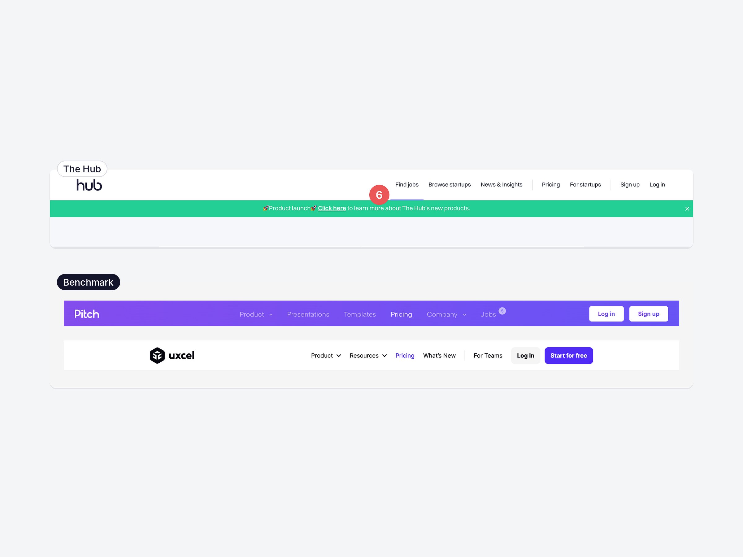
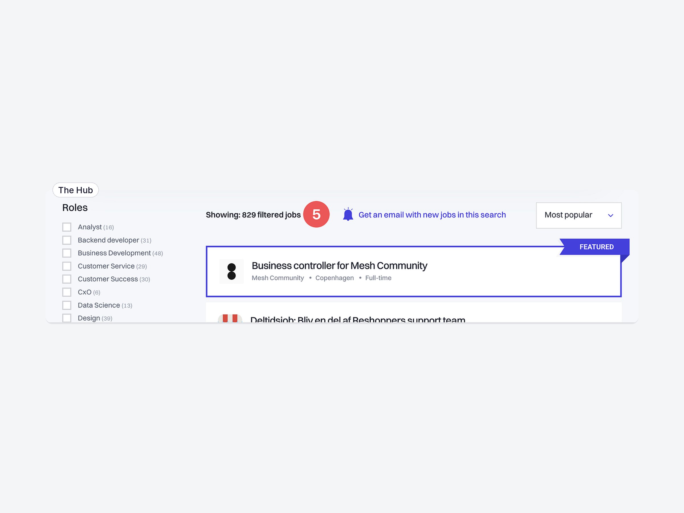
Key strategy
Give seekers control over their search, make every state honest, and calm everything that isn’t a job.
How I’d validate it
- Task test Five to eight job seekers search, filter, reset and pick a job to apply to, to confirm which issues hurt most before anything is built.
- Reset time Time and clicks to go from three filters back to all jobs.
- Featured confusion Share of people who think a featured card is selected.
- Live metrics Apply clicks per search and applications to listings older than 30 days, before and after the fixes ship.
What I learned
- Small issues add up None of the eight issues is dramatic, but a job seeker runs into most of them on every search.
- Benchmarks ground the critique Showing how familiar products solve the same pattern makes each recommendation easier to trust than opinion alone.
- An audit needs priorities Ranking issues by frequency and cost turns a list of opinions into a roadmap a team could act on.
A self-initiated concept, first presented at Dipa Inhouse’s monthly “Good and Bad Design” session and published on Medium in August 2023. It isn’t affiliated with The Hub or Balkan Brothers, the agency that designed the page. It’s based on my own research, with limited insight into their business goals. Screenshots show the page as it was in 2023.